National Park Shirts
92 national park shirts in the WPA poster tradition, Yellowstone, Grand Canyon, Zion, Yosemite, and beyond. Flat graphic style done with genuine care.
About this collection.
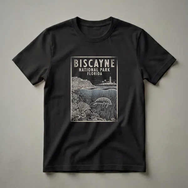
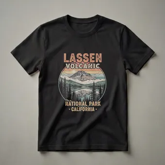
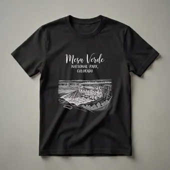
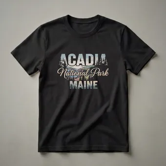
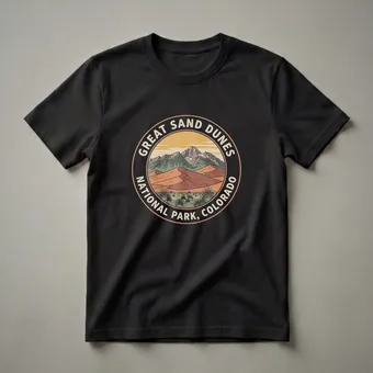
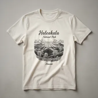
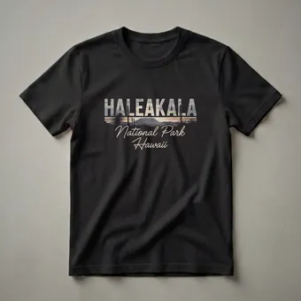
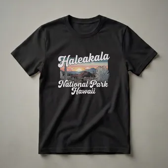
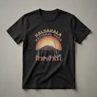
The national park poster tradition is one of the most beloved American design genres, and for good reason: it turns overwhelming landscape into something you can hold in your hand. The WPA-era aesthetic, flat color, bold silhouette, confident typography, was built specifically to make wilderness accessible without making it small. The 92 designs in this hub carry that tradition forward into the format you actually wear.
What Defines This Hub
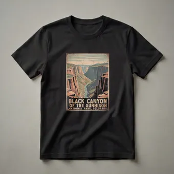
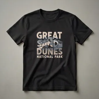
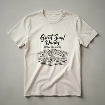
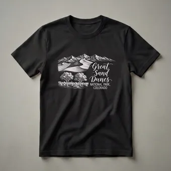
National park shirt design has a clear visual language, and the designs in this collection are organized around doing it well rather than just doing it. The hallmarks of the tradition are limited color palettes (typically 3-5 colors, with each color working hard), bold silhouette composition (mountain, tree, canyon wall against sky), horizontal layering that mirrors how landscapes actually unfold, and authoritative typography that names the park with the same confidence as the original posters.
The challenge for designers working in this tradition is that everyone has tried it. The parks are among the most-designed subjects in the print-on-demand space, which means the difference between a good park shirt and a forgettable one is entirely about execution. The designs we highlight in this hub clear a real bar: they have design decisions, not just design attempts.
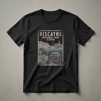
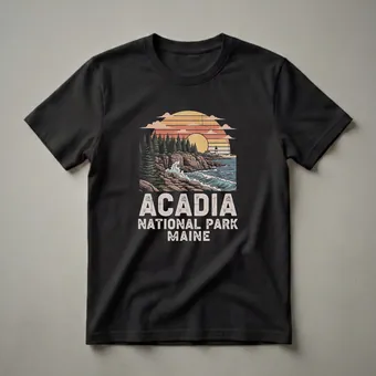
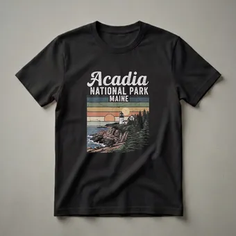
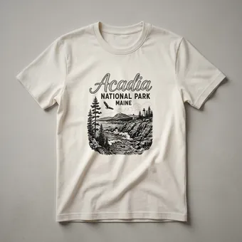
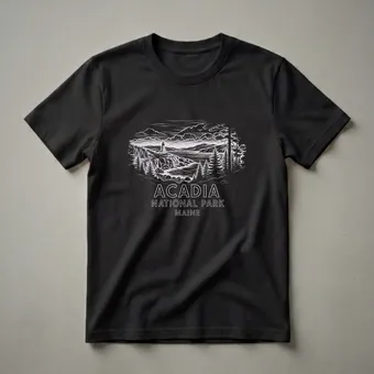
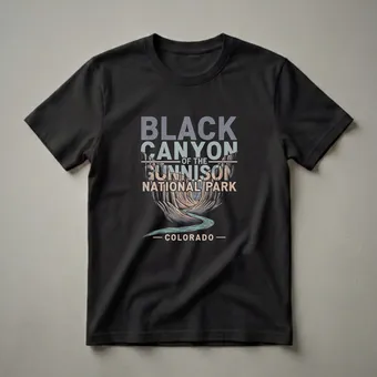
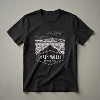
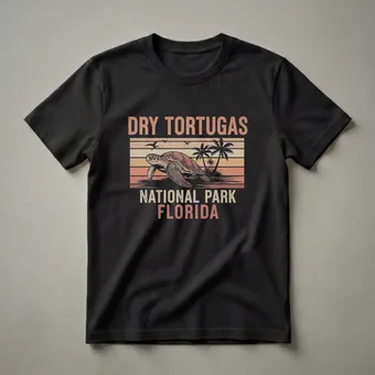
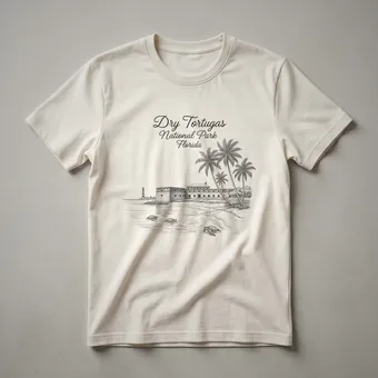
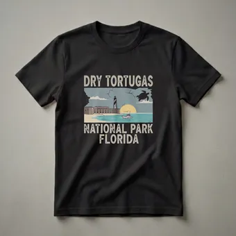
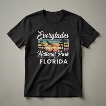
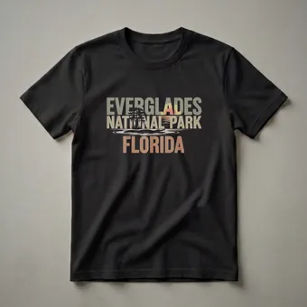
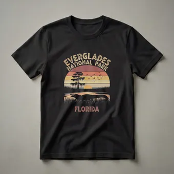
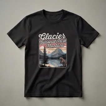
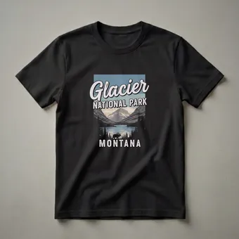
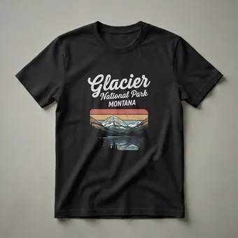
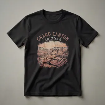
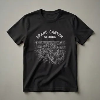
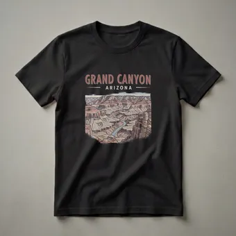
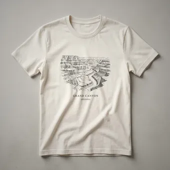
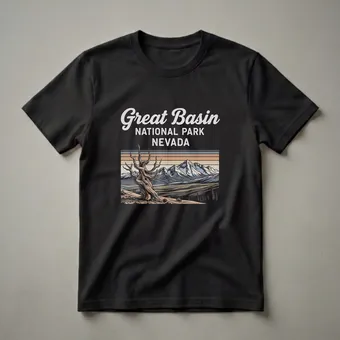
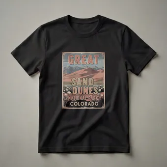
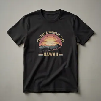
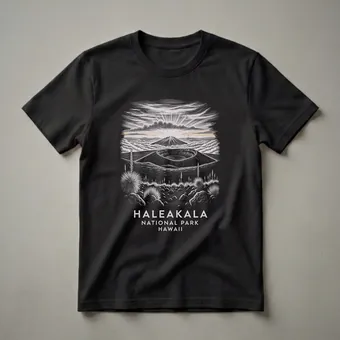
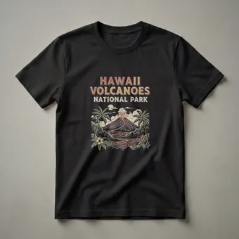
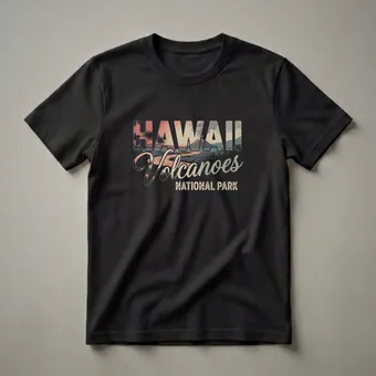
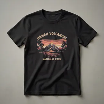
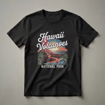
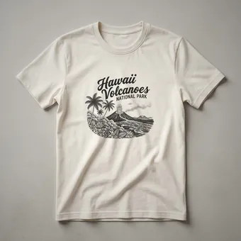
Yellowstone, Grand Canyon, Yosemite, Zion, Glacier, Acadia, Great Smoky Mountains, Olympic, Bryce Canyon, the major parks are all represented. The collection also includes designs for lesser-visited parks that have their own devoted communities: Congaree, Isle Royale, Theodore Roosevelt, Saguaro. These are the shirts that make people say "I didn't know there was a shirt for that."
Who It Fits and Gift Context
National park shirts occupy a gifting sweet spot because the audience is enormous and the quality signifier is clear. Anyone who has visited a park and loved it is a potential buyer, but the specific park matters enormously.
Park visitors who want something to mark a specific trip are the primary audience. For these buyers, the park name matters more than the design style, they want their park, rendered beautifully. The breadth of 92 designs increases the chance of finding the exact right fit.
National park enthusiasts and passport stampers, the people who have a book of park stamps and a lifetime goal of completing all 63 national parks, are particularly enthusiastic about designs for parks they've visited. For this community, obscure parks are more valued, not less.
Hikers and outdoor enthusiasts who use the parks regularly want designs that reflect the depth of their relationship, not just "I visited," but "I know this place." Designs with specific trail, landmark, or geological reference resonate with this audience over generic park-name designs.
For gifting, the safest and most resonant choice is to match the park to an experience. Post-trip gift of the park they just visited, birthday gift of the park they've always wanted to go to, retirement gift of the park they've been to forty times, all work because the specificity is what makes it meaningful.
Featured Picks
The designs that most fully inhabit the WPA poster tradition, bold silhouette, limited palette, confident typography that names the park as statement rather than label, are the ones we return to most often in this collection. Yellowstone's thermal landscape, the sheer wall of El Capitan, the layered canyon colors of Bryce rendered in four colors that somehow capture it exactly: these are the shirts where the design tradition is working at its best. We're also drawn to the lesser-known park designs, Isle Royale's remote lake character, Congaree's ancient bottomland rendered in deep greens and shadow, where the design has to do more work precisely because the landscape is less famous. The way the best designs handle typography is worth attention separately from composition. The WPA poster tradition used type with real authority, the park name was part of the design, not a label applied after the image was finished. Shirts that treat the typography as secondary miss what made the original tradition work. The strongest designs here put type and image in genuine relationship, and that choice alone separates the best from the merely adequate.
Frequently asked questions
Are all 63 national parks represented, or only the famous ones?
The major parks are most represented, but the collection includes several lesser-known parks as well. 92 designs can't cover all 63 at depth, but the range is broader than a typical gift shop — lesser-visited parks like Isle Royale and Congaree appear.
Are these officially licensed by the National Park Service?
No — the WPA poster aesthetic is not trademarked, and these are independently designed shirts inspired by the visual tradition rather than official park merchandise. They're not sold through or authorized by the National Park Service.
Is there overlap with the state travel hubs for parks in Colorado or California?
There can be thematic overlap in subject matter, but the designs differ. A Colorado mountain shirt is about state identity; a Rocky Mountain National Park shirt is about the park designation and poster tradition specifically. They serve different purposes and different audiences.