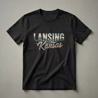
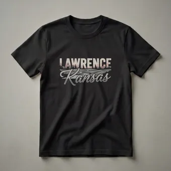
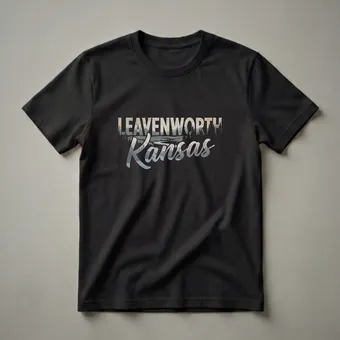
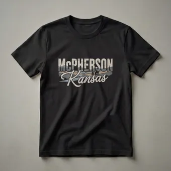
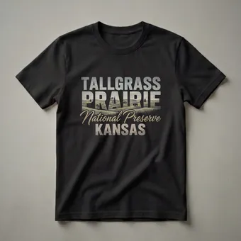
Kansas & Central Plains Shirts
52 Kansas and Central Plains shirts treating the wide horizon as the dramatic landscape it actually is. Wheat fields, big sky, and genuine Great Plains character.


About this collection.
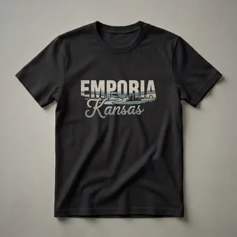
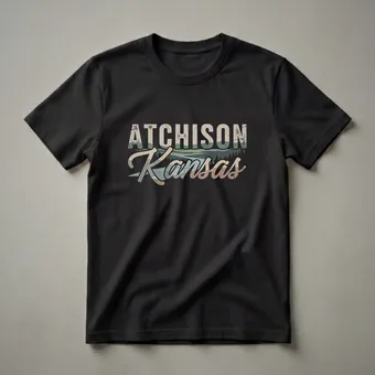
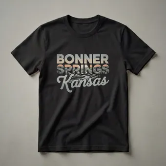
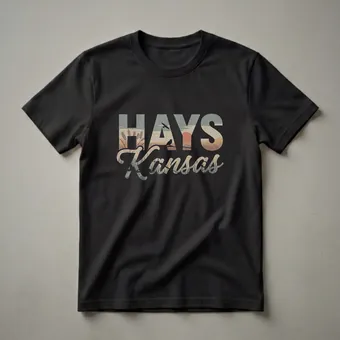
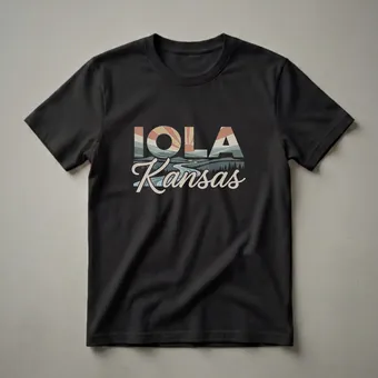
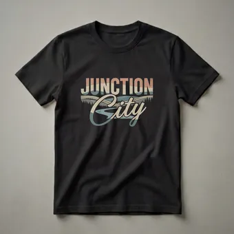
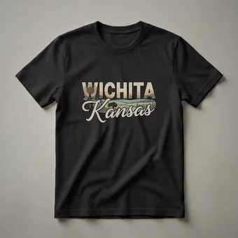
The Great Plains get dismissed as flyover country, and the designers who work in this territory seem to have made peace with that dismissal by simply making better shirts than anyone expects. 52 designs for Kansas and the Central Plains, and they're among the most visually honest in our entire retro travel collection, because there's nothing to hide behind. No dramatic mountain, no famous coastline. Just the most sky you've ever seen over the most land you can imagine, and the humans who choose to live there anyway.
What Defines This Hub
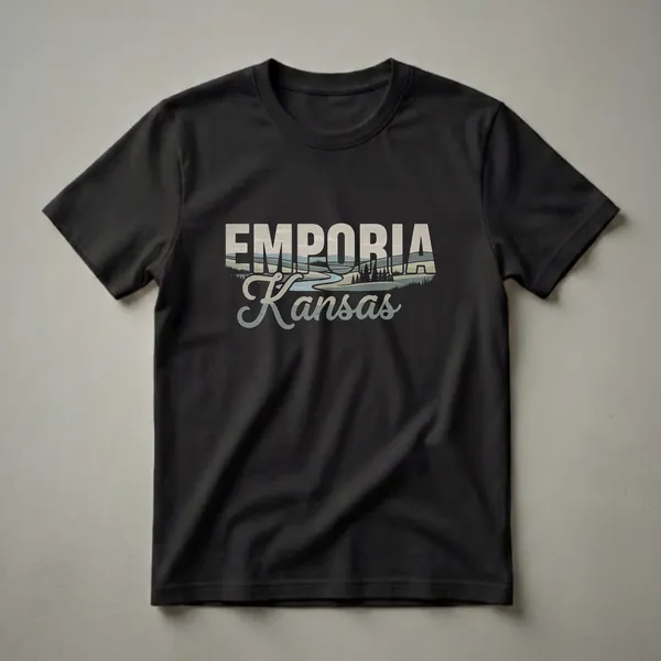
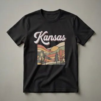
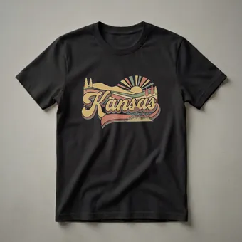
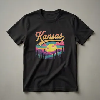
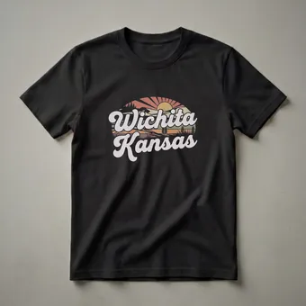
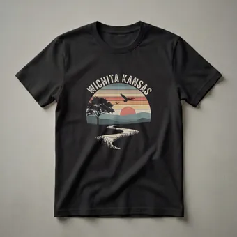
Plains design is, by necessity, horizontal. The most compelling Kansas shirts use composition that reflects the landscape itself, wide, low, anchored by a horizon line that sits in the bottom third of the image. The sky isn't background; it's the subject. The best designers understand this and build their graphics accordingly.
The color palettes here are genuinely different from other regional hubs. Where Florida leans aqua and coral, where Colorado leans alpine blue and pine green, the Central Plains palette is amber, wheat gold, storm grey, and the faded sage of summer-end grass. It's a warmer, more amber-toned visual world, and it's beautiful in a way that takes more than a moment to appreciate.
Kansas designs also tap into a historical travel tradition, the Santa Fe Trail, the Chisholm Trail, the frontier mythology that's embedded in the state's identity whether you find it romantic or complicated. Vintage typography that references these routes has a particular authority in Kansas design that feels earned rather than borrowed.
Oklahoma and Nebraska designs appear here as well, filling out the Central Plains picture with designs that share the horizontal landscape logic and the agricultural visual vocabulary.
Who It Fits and Gift Context
The audience for this hub knows who they are. Kansas natives are often the most passionate about finding a well-made Kansas shirt precisely because the options have historically been so thin. A design that takes the plains seriously, that renders them as beautiful rather than boring, is often the first shirt of its kind they've ever owned.
People with roots in the Central Plains who live elsewhere are the other core buyer. The Kansan in Seattle, the Oklahoman in Chicago, distance from the flatlands has a way of making them precious. These shirts tend to be worn with a specific affection that comes from knowing what the rest of the country doesn't know about where you're from.
For gifting, Kansas shirts work extremely well for people who've moved away and might feel slightly defensive about their home state. The right design isn't just a shirt, it's validation that the place they're from is visually remarkable, which for some people is something they've been waiting to hear.
Featured Picks
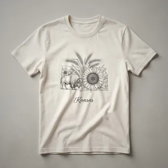
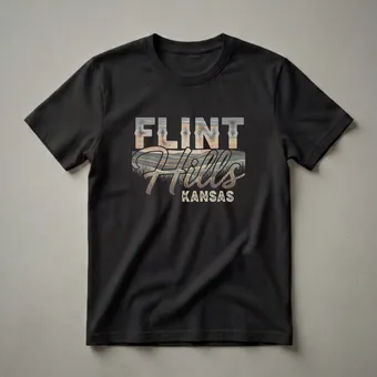
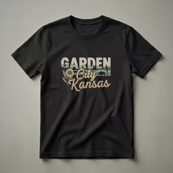
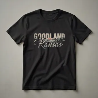
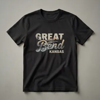
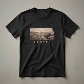
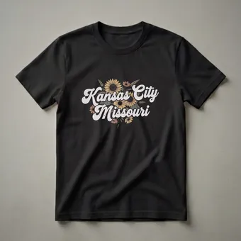
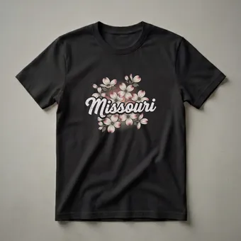
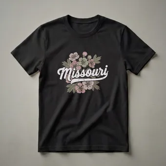
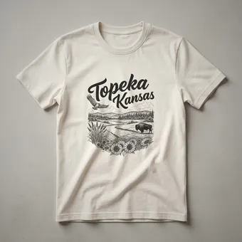
The designs that use the horizontal composition to put sky as subject, the amber-and-storm-grey palette carrying the full weight of a Great Plains sky at dusk or ahead of a weather system, are the most visually arresting in this collection. These are shirts where the design understands what it's looking at. The Santa Fe and Chisholm Trail vintage typography designs are a different tradition but equally compelling: the authority of the western route names rendered in lettering that earns its place in the graphic history of the region. Both strands of the collection reward careful browsing over quick scanning. The storm and weather dimension of Great Plains visual culture, the specific drama of a prairie thunderstorm building at the horizon, the dark green quality of light before severe weather, the aftermath of weather across a flat landscape that hides nothing, is one of the most visually powerful subjects a designer can work with in this territory, and the shirts that have found that language are the most arresting in the whole collection. The sunflower, Kansas's most recognizable symbol, is handled with varying degrees of care across the design world, and the sunflower shirts in this collection that work are the ones where the flower is treated as a design subject rather than a decorative element. The difference is visible and matters to people who have seen the actual sunflower fields of central Kansas in full August bloom.
Frequently asked questions
Does this hub include Oklahoma and Nebraska, or only Kansas?
Kansas is the primary anchor, but Oklahoma and Nebraska designs appear alongside it. The Central Plains share enough visual and cultural vocabulary that grouping them makes sense — designers working in this territory often cover the region broadly.
Are these earnest designs or novelty/joke based?
Largely earnest — these designs take the plains seriously as a landscape and a home. The dominant tone is honest pride rather than ironic detachment. Joke designs exist in the market but they're not what this hub is built around.
How does this hub differ from the Iowa & Plains hub?
Kansas & Central Plains focuses on the more arid, western-influenced character of Kansas, Oklahoma, and Nebraska. The Iowa hub leans into the agricultural Midwest tradition — corn, river country, and the greener landscape of the upper Mississippi corridor. They're genuinely different regional characters.